#cut off like 15cm
Explore tagged Tumblr posts
Text


wore my enchanté shirt today and got two (2) compliments from strangers!! worth the 45$ price tag and 15$ of customs
#although this is an extra small and I had to take it in everywhere lol#cut off like 15cm#cuffed the sleeves and took in the sides#so it’s a whole different shirt#but I love it!!#enchanté#dr3#daniel ricciardo
9 notes
·
View notes
Text


synopsis. satoru returns from his final meeting with geto before he defects.
wc. 750

satoru didn't speak to anyone when he returned to jujutsu high. he pushed past both you and shoko and especially ignored yaga’s attempts to find out more about suguru's next intentions.
understandably, suguru's slaughter had created a mass panic as it shook the foundations of jujutsu high. an 18 year old special grade sorcerer murdering an entire village (his parents included) in the beginning of his efforts to erase all non-sorcerers, i.e all humans who he has been taught to protect? it sounded unrealistic – a poor joke that no one laughed at.
"don't worry sensei, i’ll talk to him. this is just a lot." yaga gave you a small nod, but your words brought him and yourself little comfort. from yaga’s perspective, he'd just lost one special grade sorcerer, if satoru spiralled too there's no telling what the consequences could be. and you? you'd just lost one of your best friends and now you were grasping at straws trying to make sure you didn't lose your boyfriend too.
since the day you'd met him almost three years ago, satoru had kept a clear wall between the world and his emotions through his extroverted personality and humour. even after dating for eighteen months, you could only count a handful of nights when he'd let himself be vulnerable around you. admitting to the stresses of limitless and six eyes, and how he doesn't know if he'll be enough.
gojou satoru wasn’t emotionally stunted — he’d just never known what it was like not to be the strongest. since he was a child, he’d been praised and set above on this pedestal that no one else could touch.
pushing open his bedroom door, you found satoru sat at a desk, scribbling something down onto paper. "hey, toru-"
"i’m busy,” he cut off harshly, not bothering to turn back and look at you. there’s a pang of hurt in your chest again, a repeat of when he’d disregarded you after returning ten minutes prior.
he’s just hurting, you reassure yourself, as if though your heart wasn’t also breaking from losing suguru too.
"i just wanted to check in.” you tried again, stepping past the threshold into his oh-so-familiar room.
you’d woken up that morning in his bed, both of you unbeknownst to what would come. he still hadn’t tidied the sheets properly and you longed to go back in time for an extra five minutes curled up with him.
"i’m fine,” satoru insisted, spinning around on his chair to face you. he looked anything but fine. his white hair unruly like he’d been combing his fingers through it repeatedly, ultimately tangling it. his eyes were the faintest of reds but clear enough for you to see he’d been crying. his posture was tight and rigid. this wasn’t your boyfriend.
"go. i can’t deal with work and you right now." he pointed to the door when he couldn’t handle your physical analysis of him any longer. his eyes bore into yours but there seemed to be no life behind them. suguru had stolen it when he’d turned the other way, wandering down a path satoru could never follow.
"satoru," you tried reaching out to comfort your boyfriend with a hand on his cheek. you barely made it within 15cm before your hand hit an invisible barrier. there’s a dry sob that is tight in your throat and you hated this wall that he built up between you because you needed him, for him to tell you that things would be okay and suguru would come back, that this was all a big misunderstanding and he’d fix it… so why didn’t he need you too? did you not bring him any peace in the storm that’s brewing around your lives?
"go.” satoru repeated the demand again, swivelling himself back around so you were stuck with the back of his head.
your nails dug into your hands as you tried not to cry or lash out because you were both grieving. you don’t say anything as you turned to go, not trusting your voice as you felt your heart break more with each second of silence, another second he was pulling away.
and it was for the best, he concluded, for he was supposed to be the honoured one. yet he was a fraud who didn't even know his best friend was suffering, let alone not being able to save him from the path he strayed down. how can he save the only person left who really knows him?
#— toru!!#jjk#jujutsu kaisen#gojou saturo#gojo oneshot#gojou satoru x reader#gojo x y/n#gojo drabbles#gojo imagine#gojo angst#angst
799 notes
·
View notes
Text
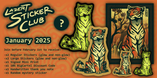
January Sticker Club design: Bengal Tiger
Join before February 1st to get this design!
By joining my sticker club for $15 a month, each month you will receive:
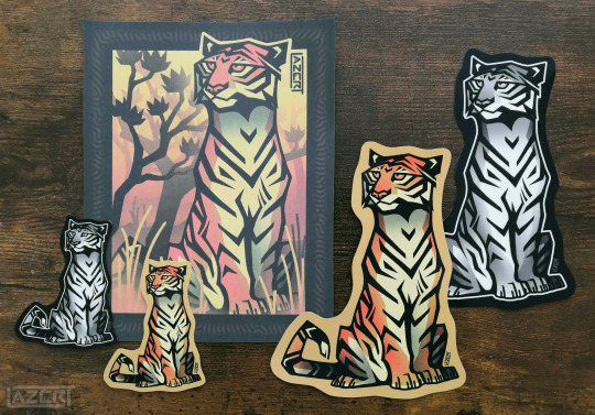
x1 Standard Vinyl Sticker (6 x 7.5cm)
x1 Large Vinyl Sticker (11.5 x 15cm) (Sticker Club Exclusive)
x1 Standard Vinyl Glow in the Dark Sticker (6 x 7.5cm) (Sticker Club Exclusive)
x1 Large Vinyl Glow in the Dark Sticker (11.5 x 15cm) (Sticker Club Exclusive)
x1 Mini Print (14.5 x 18cm) printed on coloured card + signed on the back
x1 Single-use Code for 10% off your next BigCartel store order
A hand-written thank you note from me
x1 Random mystery sticker from my store!
The design of the stickers and print will be a different animal each month!
More info below the cut:
Comes with standard untracked shipping included.
You can join and quit my Sticker Club membership whenever you like. If you are a continuous subscriber, your rewards for each subsequent month will be dispatched 1-3 days after your billing date (approximately the same date as the one you joined each month).
I also have a 1$+ tier available on my ko-fi with no specific rewards, for anyone who would like to support me otherwise.
If you would prefer just the standard sticker without the subscription, it can be bought individually through my store here.
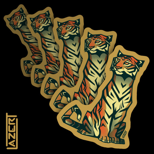

Large and glow-in-the dark stickers of this design remain exclusive to the Sticker Club and will be unavailable after January 31st.
February 2025's design will be revealed later this month.
#sticker club#kofi sticker club#kofi membership#kofi#ko-fi#subscription#stickers for sale#stickers#glow in the dark stickers#art prints#art for sale#tiger#bengal tiger#royal bengal tiger#Panthera tigris tigris#Panthera tigris#lazert#lazer-t#self promotion#announcement
49 notes
·
View notes
Text
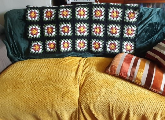
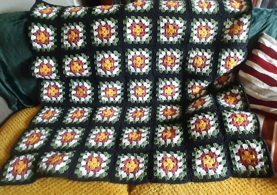
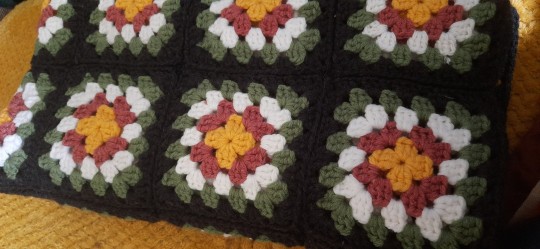
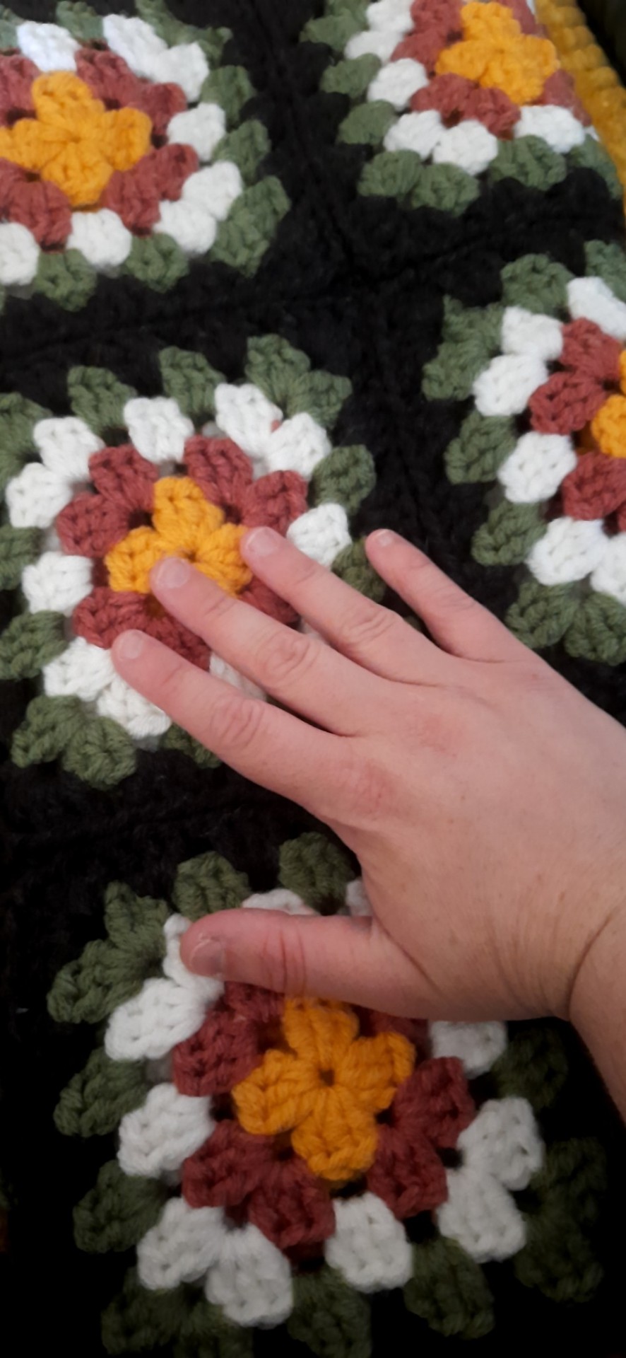
Been working with Tegridy these past couple of weeks!!!!! This took forever to finish - so many ends to weave in lmao. I'm so glad it's done though.
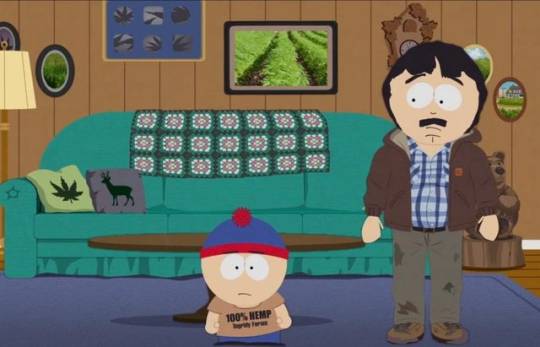
I kind of posted about the Tegridy Farms blanket here like last night, but figured since it's actually done now you all deserved some pictures, alongside a repost of my notes on making it. I really love the overall vibe of the colours and composition and I like to hope that I captured some of that here.
Notes regarding yarn, sizing etc. from previous post for completion's sake under the cut:
My color choices aren't a 1:1 match with the ones in the show. I would still argue them as "realistic" versions allowing for the saturation of coloring on the BG in the show, but YMMV and gatekeeping my technically incorrect choice would be beyond silly. I just really like making stuff I see in cartoons.
I basically tried to make this thing roughly to scale with the one in the show though, as others I saw worked single strands of DK yarn, resulting in a really small blanket.
I did some math by measuring the heights of a square of the blanket and the couch on the screencap given above and cross-referencing it with the average height of a couch (regarding my formal diagnosis and to quote tiktok, "I have this thing, it's AUTISM"). The result was each square measuring approximately 13-15cm iirc.
I just used a basic granny square layout with this method on regular DK yarn with a 7mm crochet hook to work the squares into the ideal size. They sat at just over 15cm and I somehow only just had enough of the gray yarn. I imagine from what we see that the blanket is 7x7 squares with the others hanging off the back out of sight, so I made 42 squares in total.
Most of the yarn (except the white which was just some salvaged stuff) was Aldi UK's seasonally stocked "So Crafty" acrylic Double Knit yarn, so I was certainly sweating bullets re: if I even had enough (not sure how easy substitutes would have been). Color names are Wheat, Grass, Rose Garden, and Gun Metal.
Technically the cushions are also achievable in crochet - they would use c2c (corner to corner) and I think that's 100% the intent in their design due to the blocky/pixelated appearance of the images. There's plenty of charts for images like those, but making your own would work too. I would definitely like to hear from whoever on the design team chose to put these in the BG and if they were inspired by something or someone, since with the cushions especially it feels weirdly specific to me to use crochet in like 2017 for the "homely and rustic weed farmhouse" vibe I imagine Randy trying to force here. Based on eyeballing it and my square sizes, I'd aim for a 30cm² cushion maybe.
147 notes
·
View notes
Note
Since felix has the smallest hands in skz, which are like 18cm, how would he react once he finds out his s/o has even smaller hands? (cos my hands are 15cm 😭💔)
WOOO MY FIRST ASK LIKE THIS!!
Anyways I feel like he’d sort of.. like it? He’d like knowing that there’s another person he knows that has even SMALLER hands than him, he’d also probably playfully tease you for it.
BUT. If we’re getting into smutty territory.. (under the cut.)
Looking at your small hands trying to jerk him off probably is a big turn on for him as he watches you struggle to hold it 😵💫
And he always smirks at you when you’re getting yourself off since he knows your hands are small and they wont work the same as his.
Even though it’s only smaller by a few centimetres he’s still gonna be turned on.
36 notes
·
View notes
Text
Custom Acrylic Badge Pre-Orders


Do you want to show off your Ponysona/Fursona at the next convention? Would you like a sturdy badge you don't have to worry about bending?
Check out my acrylic badges! They are 15cm tall, double sided and have a clip to easily attach them to your lanyard!
More info below the cut!
Base Price: 60€ Shading: +10€ Different Front/Back art: +15€
Shipping (including tracking): Germany: 4€ European Union: 9€ United Kingdom: 12€ Everywhere else: 16€
I currently only need 3 more orders to reach minimum orders and produce them! Current shipping time is planned for December, but this might change for earlier or later depending how fast the slots fill up!
#furry#mlp#badge#furry badge#furryart#furryartist#mlp fanart#pony#commission#commissions open#furry commissions#mlp commissions
19 notes
·
View notes
Text
Storm Hawks Bird OC Challenge - June 2023
Happy pride month everyone! Did I try to google "World's Gayest Birds" for this challenge? You'll never find out. I did and it didn't help.
This month's bird is the super pretty splendid sunbird (Cinnyris coccinigastrus)!

Splendid sunbirds are passeriform birds that reach around 15cm in length, with brilliant iridescent colouring. They're seasonal migrants with breeding grounds in central and sub-saharan africa, with beaks shaped to be ideal for feeding off of nectar. Females have brown feathers and can be mistaken for the females of the copper sunbird species, but are identified by their streaked bellies.
I hope everyone has fun with this one! Deadline this month is Tuesday the 27th of July. As always, rules, an optional colour guide and more photos are located under the cut.
Minimum requirements for drawn entries to be put in the winner’s vote are a name, occupation, the character’s home/birth Terra and at least one paragraph (or about 100 words) of written backstory.
Minimum requirements for written (i.e. written dossiers without art, or mini-fics for the character) are 500 words including backstory and appearance. Feel free to make a mini-fic out of this challenge, I’ll make sure to link it with the final collage as well.
Entrants who are part of the Storm Hawks discord server will have the chance of getting a custom role for the next month! If you’re not part of the discord server, please ask for an invite if you’re interested.
You’re not expected to create a character from scratch for this challenge. If you’ve got an older character concept that’s been collecting dust or that you’d like to take the opportunity to revamp, feel free! The goal of this challenge is to inspire people.
Collaborations are allowed! Same rules apply, the only addition is that you and your partner(s) just need to make note of who was responsible for what part of the character
Make sure to tag me in your entries and also DM me with a link to your entry. Tumblr is not always reliable about notifications for this sort of thing, and I don’t want to risk missing anyone’s entries, so better safe than sorry.
The group collage of entries, and the winner’s vote are opt-in. Participation of those parts of this challenge are not mandatory.
The winner of the vote will receive a free sketch piece of their character from me.


#op#storm hawks#storm hawks oc challenge#oc challenge#storm hawks oc contest#bird oc challenge#storm hawks bird oc challenge#storm hawks oc#splendid sunbird#colour palettes#colour palette#colour inspiration#colour inspo
13 notes
·
View notes
Note
Your book turned out so well, it looks amazing!!! I was wondering if you could explain how you do the cover art + get it attached to the hardcover. I'm looking to get into fanbinding myself and the way yours turned out looks like the sort of things I would love to make!
Thank you! ^^ I'll try my best to explain what I did/should have done, but I was making it up as I went, so there was a lot of trial and error and back and forths.
Under a read more because this turned out very long.
My cover art is three separated pieces that were glued together. I made the design on Adobe illustrator. Since I wanted it to be symmetrical, I sketched on paper just a quarter of it, scanned it and opened on Illustrator. Traced it, copied/pasted, mirrored the copy to do the other half, then copied/pasted/mirrored the top to make the bottom part. Added details, done.
Basically the widths of my hardcover were 15cm and the spine was 2,7cm and they were organized like this: hardcover + gap of 0,2cm + spine + gap of 0,2cm + hardcover (these gaps are there so the book can open; you can't have the covers right next to the spine. I use the thickness of my hardcovers as measurement for these gaps).
I printed the art in separated pages, attached them together and laminated the whole thing before gluing the hard covers on it.
I used the the spine art to attach the three pieces together: I made my file to be 2cm wider than the measurement of the spine + the gaps. I centered the art on the file (the art should have the same width of the spine or be smaller) and used the 1cm I have on each side to attach to the covers. So my spine is 1cm + 0,2cm + 2,7cm + 0,2cm + 1cm (overhang to attach to the cover + gap + width of the spine (my text block just happened to be 2,7cm thick) + gap + overhang).
The cover art is were I messed up. You need to make your cover art files large enough to fold around the edges of your hardcovers but only on three sides: top, bottom and the edge that isn't attached to the spine. I made mine with overhang on all sides, that's why the art isn't centered on the cover, you can check the picture below, see how it's closed to the edge? It's because I didn't pay attention and didn't cut off the excess from the "spine side".

Keep in mind that the spine art will overlap the edges of the covers, so when you're doing your measurements/calculations, be careful to not add up these measurements (in my case, 2cm from the spine can't add up to the final measurement of the cover, because the edges of the spine art will be on top of the edges of the covers, not beside them). So, in my final measurement of the whole width of the cover, the spine should virtually be the thickness of the textblock (2,7cm in my book) + the gaps, since the attachment points (1 cm on each side) will be on top of the covers.

See the light green rectangle in the middle? That's the spine art. It overlaps on the pink area, that represents the cover file. (I made this guide image to help myself next time I make a book, since it was a lot of trial and error; this was actually made based on the mistakes from the first book).
Oh, and just in case you want to use this image here as base to your fanbook, the hard covers i used are 21cm high and 15cm wide. The total height is 23cm (1 cm overhang on top and bottom). The total width will depend on the thickness of your text block. I used 2,7cm on the guide image but it'll actually depend on how thick the text block is.
I followed this tutorial for page design, printing and signature making guides and this one to learn how to sew the signatures together.
As a general rule, I like my hardcovers to be around 1cm taller and 0,5cm wider than my text block.
I hope this made sense. I'm sorry if I repeated my self too many times, I'm not very good at explaining things. 😅
12 notes
·
View notes
Text
I reached my next gw!!! But also, I had an impulse and cut off like 15cm of my hair last night… so could be that too. So I’m waiting a couple of days before I get the treat!
3 notes
·
View notes
Text
Detective Ignis AU! Just something that popped into my head the other day. He'd make an amazing detective, no?
This is just a little summary / concept. I did write a couple chapters, but me and finishing fics... or posting them at all... 😅
After an accident involving a coeurl or ten, Ignis Scientia had lost his sight. His hunting career is over. His tracking skills and his sheer intellect put him on a new path - one of an aspiring private detective.
But he has to start small. Like, really small. No more than 15cm tall, in fact. His first case is a dead frog. His first client is Sania the looney scientist. And his first clue is a scent - a sharp, acidic scent hanging over the bloody pond.
His only help comes in the form of occasional sarcastic comments from Noct, a mysterious young hunter. Noct's from "nowhere important" in the country of "mind your own business". His terms are simple. He escorts Ignis on his investigations. He gets a cut of the profits, along with any loot they acquire in the wild.
Noct is always ragged, shirt button eternally on the verge of falling off. He lacks manners. And friends. And any kind of acquaintances in the area, as far as Ignis can tell. The one thing he doesn't lack are weapons. And rage - strange, almost ethereal rage, always burning behind those dark blue eyes.
He's almost too suspicious. And yet, he's Ignis' first suspect. Obvious isn't always wrong.
What would be wrong is making out with said suspect in an abandoned shed on their way home from questioning a local fisherman.
As stories start to unravel and masks fall off, Ignis is forced to reconsider whether he really is starting small, or uncovering revelations that will shape Eos' future.
#chocobros#final fantasy 15#final fantasy xv#ignis scientia#noctis lucis caelum#ffxv#ffxv au#ffxv noctis#ffxv fanfic#ff15#ff15 au#ff15 fanfic#ignis#ignoct
5 notes
·
View notes
Text
First I wondered: How does it work? Does incense go inside the body, or are sticks supported by the legs and claws?
Then I went to the Met's website for a zoomed-in closer look.
Answer: It goes inside, because the back (wing-cover) is a separate part. That''s visible, but if there's a hinge inside is impossible to tell.

Hinged or lift-off, it opens so a piece of incense, maybe a couple of sticks cut to length, can be placed inside and lit.
Once the burner is closed again, smoke comes out through this little hole...

...which at first sight looks like a flaw or damage.
However it seems exactly the same shape on both layers so may - I'm just guessing, the Met page doesn't even mention it, never mind clarify it - actually represent a stylised kanji.
At nearly 9cm (3 inches) tall and just over 15cm (6 inches) long, it's life-size.

Whether a life-size smoking mantis is something you'd want in your house rather depends on your attitude to very large insects, smoking or not.
Personally I'd rather have a dragon, and this amazing bronze at the Cernuschi Museum of Asian Arts in Paris is not only from Japan as well, but is even from the same period (Meiji) as the mantis.

Although I suspect it would need a much bigger or at least sturdier shelf...

A 19th century Japanese incense burner in the form of a praying mantis, iron and gold, with a lining of silver. Dimensions (h x l): 8.9 x 15.2 cm.
The Metropolitan Museum of Art , New York.
595 notes
·
View notes
Text
Hair more like 20cm shorter but it's cute ngl.
I love playing hair length roulette. Never know how much they'll cut off I'm just like yeah about 15cm and see how they interpret that.
#its fun#also takes away me having to decide which length i want#and since i dont care as long as i cam pull it into a ponytail eh....#personal
1 note
·
View note
Text
Vegan Wellington Recipes
>>>Get FREE 198 pg Delicious Meat-Free Assorted Recipes EBook<<<
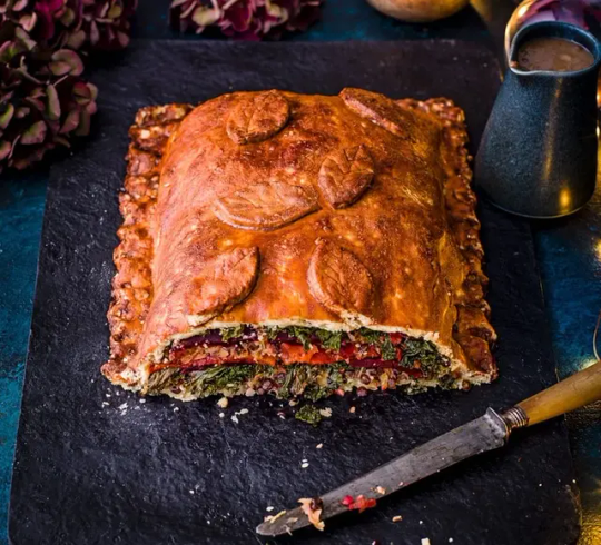
Giant wellington is a showstopping centrepiece packed with roasted red peppers, cooked beetroot and kale. Plus, we've made a vegan stuffing and glazed the pastry in marmite to take it to the next level
Ingredients
1 tbsp olive oil
2 cloves garlic, finely chopped
250g kale, tough stalks removed
250g pack cooked beetroot, thinly sliced from a jar 3 roasted red peppers, drained and halved PASTRY
500g plain flour, plus extra for dusting
210ml olive oil
7 tbsp aquafaba, see notes below
STUFFING
2 tbsp olive oil
1 onion, finely chopped
150g swede, coarsely grated
2 cloves garlic, finely chopped a few sprigs thyme, leaves stripped a good grating nutmeg
200g pouch ready-cooked puy lentils
1 apple, coarsely grated
30g hazelnuts, toasted and finely chopped
50g breadcrumbs
1 lemon, zested GLAZE
1 tsp Marmite
GRAVY
1 tbsp vegetable oil
1 shallot, finely chopped
100ml brandy
1 tbsp pink peppercorns, lightly crushed
3 tbsp vegan gravy granules, see notes below
50ml soya cream Method
STEP 1
To make the pastry, mix the flour with 1 tsp salt then stir in the olive oil and 5 or 6 tbsp of aquafaba until it comes together as a dough, then knead lightly for 30 seconds. Cut 1/3 of the pastry from the block, then wrap and chill both blocks for 30 minutes.
STEP 2
Meanwhile, make the stuffing. Heat the olive oil in a frying pan and cook the onion and swede for 5-10 minutes or until soft. Add the garlic, thyme and nutmeg, and cook for a further minute. Tip in the cooked lentils, apple and hazelnuts, and cook for 1 minute before stirring through the breadcrumbs and lemon zest.
>>>Get FREE 198 pg Delicious Meat-Free Assorted Recipes EBook<;<<
STEP 3
Heat 1 tbsp olive oil in a large pan and cook the chopped garlic for 2 minutes until fragrant. Add the kale and a splash of boiling water, and cook until the kale has wilted and the water has evaporated. Season and cool.
STEP 4
On a lightly floured piece of baking paper, roll out the 1/3 of pastry to a 25cm x 15cm rectangle, then slide onto a baking sheet. Spoon �� of the stuffing onto the pastry in an even layer, leaving a 1cm border. Add ½ of the kale mixture, ½ of the beetroot slices and all the pepper slices, so that you have clear layers. Spoon the remaining stuffing mix on top of this, then repeat with the remaining beetroot and kale.
STEP 5
On another lightly floured piece of baking paper, roll out the remaining pastry to a 35cm x 30cm rectangle. Carefully flip the pastry onto the wellington and peel off the baking paper. Use your hands to mould the pastry round so it is tight to the filling. Use your finger and thumb to crimp the edges of the pastry so it’s completely encased, then trim any excess. Roll out any excess pastry and decorate, if you like. Chill for 30 minutes.
STEP 6
Heat the oven to 200C/fan 180C/gas 6. Mix the Marmite with 1 tbsp aquafaba and use this to glaze the entire wellington. Put into the oven for 25-30 minutes or until the pastry is crisp and golden.
STEP 7
To make the gravy, heat the vegetable oil in a small pan and cook the shallot for 5 minutes until soft. Tip in the brandy and pink peppercorns. Mix the gravy granules with 350ml water and pour in. Simmer for 5 minutes until thickened slightly, then stir through the soya cream. Keep warm but do not boil. Cut the wellington into thick slices and serve with the gravy.
>>>Get FREE 198 pg Delicious Meat-Free Assorted Recipes EBook<;<<
#giant Wellington#Organism#Veggies#Veggierecipes#Vegetarian#vegan food#go vegan#what vegans eat#plant based
0 notes
Text
Digital Portfolio

Media: Ink
Size: A1
This is a drawing of a female form, focusing on creating deep shadows and a clear gesture, as well as trying out a pose that I found interesting to draw from.

Media: Chalk
Size: Roughly A1
In this piece the task was to shade only where the light hit the body instead of drawing the outlines and shading the shadows. This allowed me to focus on the highlights.

Media: Charcoal
This piece was one of my first 10 minute sketches, where I tried to focus more on gesture than shape.

Media: Charcoal
Size: A1
I enjoyed this one a lot. These were 1-2 minutes sketches using the charcoal on its side and trying to use only straight lines to convey gesture and display figure.

Media: Pencil and Charcoal
These were my first set of 15 minute drawings, where I was trying to experiment.
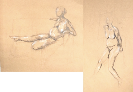
Media: Pencil, chalk, and charcoal
Size: Roughly A4 each
This is were I began to focus on shadows and highlights more, as well as exploring perspective and foreshortening.
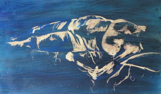
Media: Ink, bleach, and pastels
Size: A1
In this piece I had to be careful not to completely outline the body and focus on just the highlights with the bleach. I didnt think I could get the head in while just looking at the highlights so I focused on the torso and thighs. I also tried to deepen shadowy areas slightly with a blue pastel.

Media: Ink
I began to look at movement by overlapping different poses on top of each other in different colours. The model would dance until someone said stop then we would have 3 minutes to draw the pose.

Media: Pencil and ink
This was also a piece looking at movement, it was the models movement from standing, to sitting on a chair, to sitting on the floor, to finally laying down. I used the same media for every other pose. pencil for the 1st and 3rd and inks for the 2nd and 4th. I also began to use more vibrant colours.

Media: Acrylics and pencil
This was my first exploration with acrylics whilst life drawing. I wanted to focus on the legs so I could experiment on the foreshortening with the legs.
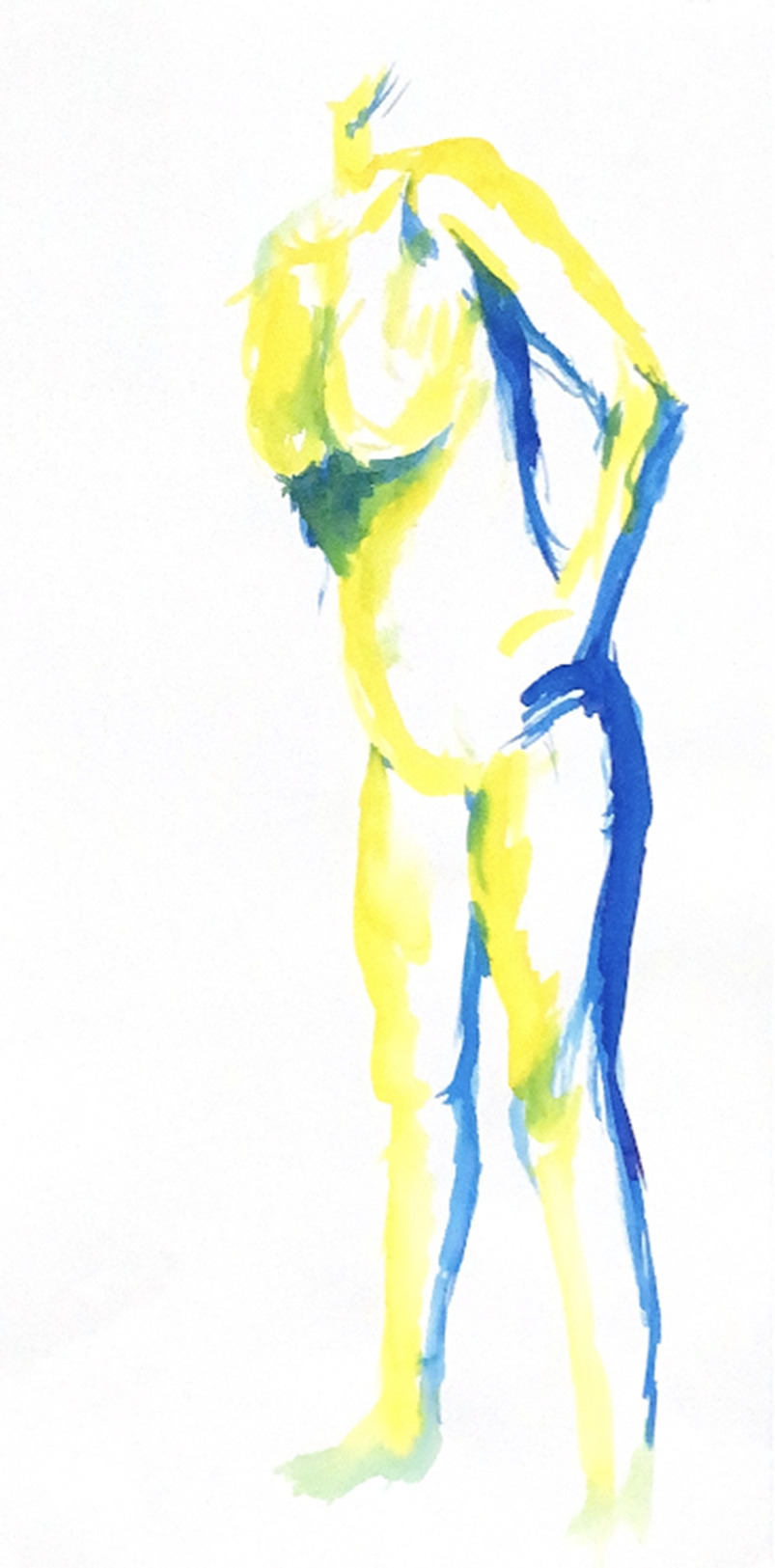
Media: Ink
In this piece I tried to be a bit bolder with the inks and didnt use pencil to out line the figure.

Media: Acrylics and pencil
Whilst I did use some pencil in this piece to outline, I tried to reduce how much I out lined. I also tried to use more mid tones to make the highlights look lighter and shadows look darker. This was a difficult pose for me so I tried to only focus on some of the body to get the foreshortening.

Media: Soft pastels
I like this piece. I focused on gesture with this piece and tried to exaggerate the slight turn to the left and weight put on the back foot. I also focused on the shadow and highlights, especially on the back.

Media: Screen print and sewing
Size: A3
This is a single screen print design repeated and overlapped on a piece of fabric. I then sewed over the top in red and orange following the pattern of the screen print.

Media: Screen printing
Size: A3
This is the same design layered on a piece of paper, that I cut up and the weaved back together.

Media: Paper (laser cut)
Size: Each circular design ranges from 10cm - 15cm in diameter
These are my paper cuts and designs which were a development piece. I used black sugar paper, white paper and tracing paper with each design printed out several times in the different papers. On the physical piece they are raised off the backing paper with sticky foam giving them different elevations.

Media: Fabric, dyes, screen print, paper cuts, dissolvable fabric outcomes .
Size: A2
This is a mock piece where a put several development pieces together. This used a lot of experimentation, and some trial and error especially with the fine lines of the screen print design.

Media: Fabric, dyes, screen print, paper cuts, appliques, and sewing
Size: Circle is 20 cm diameter, and rectangle is just bigger than A4
This is a set based off of a the same piece but going in 2 different directions. I began sewing into these pieces and continued with the circle organic theme, using patterns to sew them together instead of just outlining the separate pieces.

Media: Fabric, dyes, screen print, paper cuts, applique, sewing, dissolvable fabric outcomes
Size: Each fabric circle base is about 20 com in diameter
This was my final outcome of this set of experimentation. 2 of the fabric circles are separate, and 2 of them are connected with the appliques and paper cuts. As they aren't all connected they can be rearranged or even hung up.

Media: Pencil and Acrylic paint
Size: A1
The one on the left is a scan which has more focus but makes it too light/white. The one on the right is a photo, which has less focus but show the colours better.
This is part of the first project from the course that I'm currently on. In this piece I explore linear perspective as well as attempting to grey colours out as they extend into the distance. This is technically still a work in progress, as I haven't finished the view from the window.

Media: Foam board, and Styrofoam
Size: The base circle is 15cm in diameter, the top of the arc (where the "brain" rests) is 10 cm in diameter.
This was a model I made in the 2nd project, that had to involve an aspect of the body. I chose the brain and decided to do a museum with an auditorium at the top. This is all created without the help of a computer or machine, which meant it took up a lot of my time and effort.
Unfortunately I was too focused on creating this piece, and I dont think I explored around as much as I wish I had done, but I am glad that it came out as well as it did despite this. It also helped me realize that I needed to explore more colour, texture and materials with each project.

This is a board with some of my initial ideas, final ideas and some tests with materials and getting them to flex.
This is one of my recent projects (3rd project, finished as of 30th of January), where I'm designing a sculptural small building. It has to do with giving a place for the homeless to sleep without causing issues, and whilst being a sculptural piece .
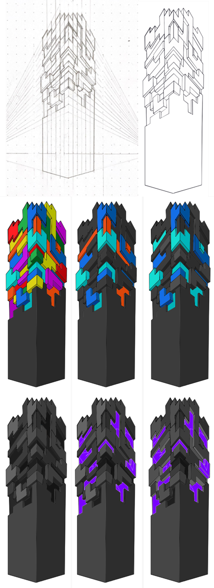
This is part of my current project. These pieces were part of my colour and shape exploration after I looked into the MahaNakhon Tower. I had decided to explore a geometrical aspect and how different colours and lighting would affect it. I started it with a hand drawn sketch and transferred it digitally into illustrator. I also tried to give a glowing effect.
0 notes
Text

Media: Ink
Size: A1
This is a drawing of a female form, focusing on creating deep shadows and a clear gesture, as well as trying out a pose that I found interesting to draw from.

Media: Chalk
Size: Roughly A1
In this piece the task was to shade only where the light hit the body instead of drawing the outlines and shading the shadows. This allowed me to focus on the highlights.
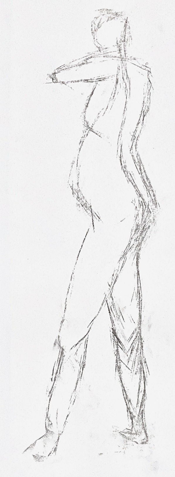
Media: Charcoal
This piece was one of my first 10 minute sketches, where I tried to focus more on gesture than shape.

Media: Charcoal
Size: A1
I enjoyed this one a lot. These were 1-2 minutes sketches using the charcoal on its side and trying to use only straight lines to convey gesture and display figure.

Media: Pencil and Charcoal
These were my first set of 15 minute drawings, where I was trying to experiment.

Media: Pencil, chalk, and charcoal
Size: Roughly A4 each
This is were I began to focus on shadows and highlights more, as well as exploring perspective and foreshortening.

Media: Ink, bleach, and pastels
Size: A1
In this piece I had to be careful not to completely outline the body and focus on just the highlights with the bleach. I didnt think I could get the head in while just looking at the highlights so I focused on the torso and thighs. I also tried to deepen shadowy areas slightly with a blue pastel.

Media: Ink
I began to look at movement by overlapping different poses on top of each other in different colours. The model would dance until someone said stop then we would have 3 minutes to draw the pose.

Media: Pencil and ink
This was also a piece looking at movement, it was the models movement from standing, to sitting on a chair, to sitting on the floor, to finally laying down. I used the same media for every other pose. pencil for the 1st and 3rd and inks for the 2nd and 4th. I also began to use more vibrant colours.
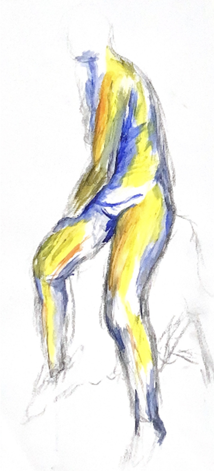
Media: Acrylics and pencil
This was my first exploration with acrylics whilst life drawing. I wanted to focus on the legs so I could experiment on the foreshortening with the legs.

Media: Ink
In this piece I tried to be a bit bolder with the inks and didnt use pencil to out line the figure.

Media: Acrylics and pencil
Whilst I did use some pencil in this piece to outline, I tried to reduce how much I out lined. I also tried to use more mid tones to make the highlights look lighter and shadows look darker. This was a difficult pose for me so I tried to only focus on some of the body to get the foreshortening.

Media: Soft pastels
I like this piece. I focused on gesture with this piece and tried to exaggerate the slight turn to the left and weight put on the back foot. I also focused on the shadow and highlights, especially on the back.

Media: Screen print and sewing
Size: A3
This is a single screen print design repeated and overlapped on a piece of fabric. I then sewed over the top in red and orange following the pattern of the screen print.
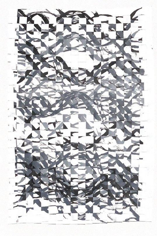
Media: Screen printing
Size: A3
This is the same design layered on a piece of paper, that I cut up and the weaved back together.
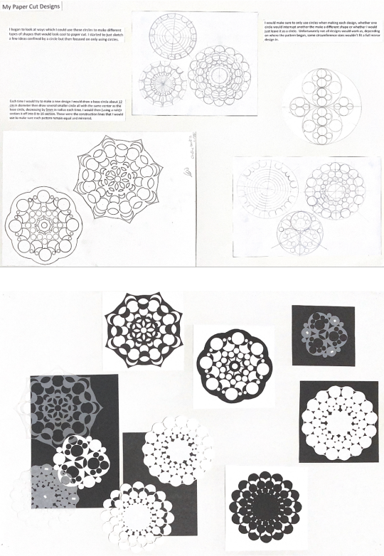
Media: Paper (laser cut)
Size: Each circular design ranges from 10cm - 15cm in diameter
These are my paper cuts and designs which were a development piece. I used black sugar paper, white paper and tracing paper with each design printed out several times in the different papers. On the physical piece they are raised off the backing paper with sticky foam giving them different elevations.
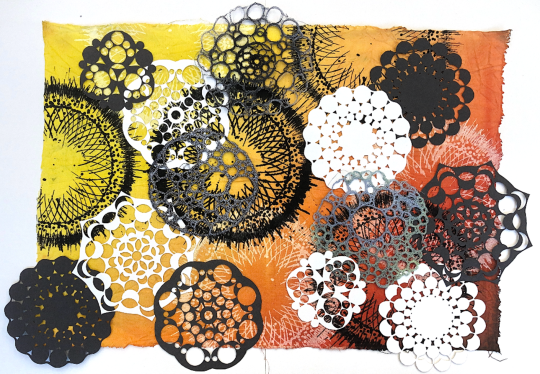
Media: Fabric, dyes, screen print, paper cuts, dissolvable fabric outcomes .
Size: A2
This is a mock piece where a put several development pieces together. This used a lot of experimentation, and some trial and error especially with the fine lines of the screen print design.
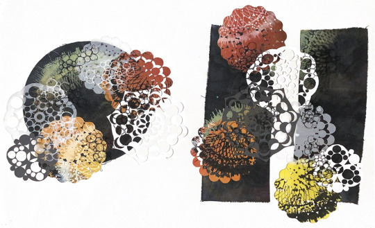
Media: Fabric, dyes, screen print, paper cuts, appliques, and sewing
Size: Circle is 20 cm diameter, and rectangle is just bigger than A4
This is a set based off of a the same piece but going in 2 different directions. I began sewing into these pieces and continued with the circle organic theme, using patterns to sew them together instead of just outlining the separate pieces.

Media: Fabric, dyes, screen print, paper cuts, applique, sewing, dissolvable fabric outcomes
Size: Each fabric circle base is about 20 com in diameter
This was my final outcome of this set of experimentation. 2 of the fabric circles are separate, and 2 of them are connected with the appliques and paper cuts. As they aren't all connected they can be rearranged or even hung up.

This is a board with some of my initial ideas, final ideas and some tests with getting the materials to flex.
This is one of my current projects, were I'm designing a sculptural small building. It has to do with giving a place for the homeless to sleep without causing issues, and whilst being a slight sculptural piece.
1 note
·
View note
Text
my dog jumped on my desk and knocked my lil aphrodite statue onto the floor and her head broke off . do u think she’s mad at me xxxx
#whoops anyway it was a clean cut so we r gonna superglue it back on#this is the second time her head has fallen off but in a. DIFFERENT place which is odd#first time was in my suitcase bringing her back from itsly#she’s only small like 15cm high maybe#i
1 note
·
View note